LinkedIn came to us for a new initiative to drive awareness and excitement for upcoming feature releases for their suite of hiring tools (Recruiter, Jobs, and Career Pages). Unlike their typical quarterly releases at the time, this would give a preview of updates in the year to come, laying out a vision of innovation to cut through the noise and impress decision-makers at enterprise companies.
We created a highly successful digital campaign for the initial launch, then reimagined and built on that success for another launch—expanded and upgraded—the following year.
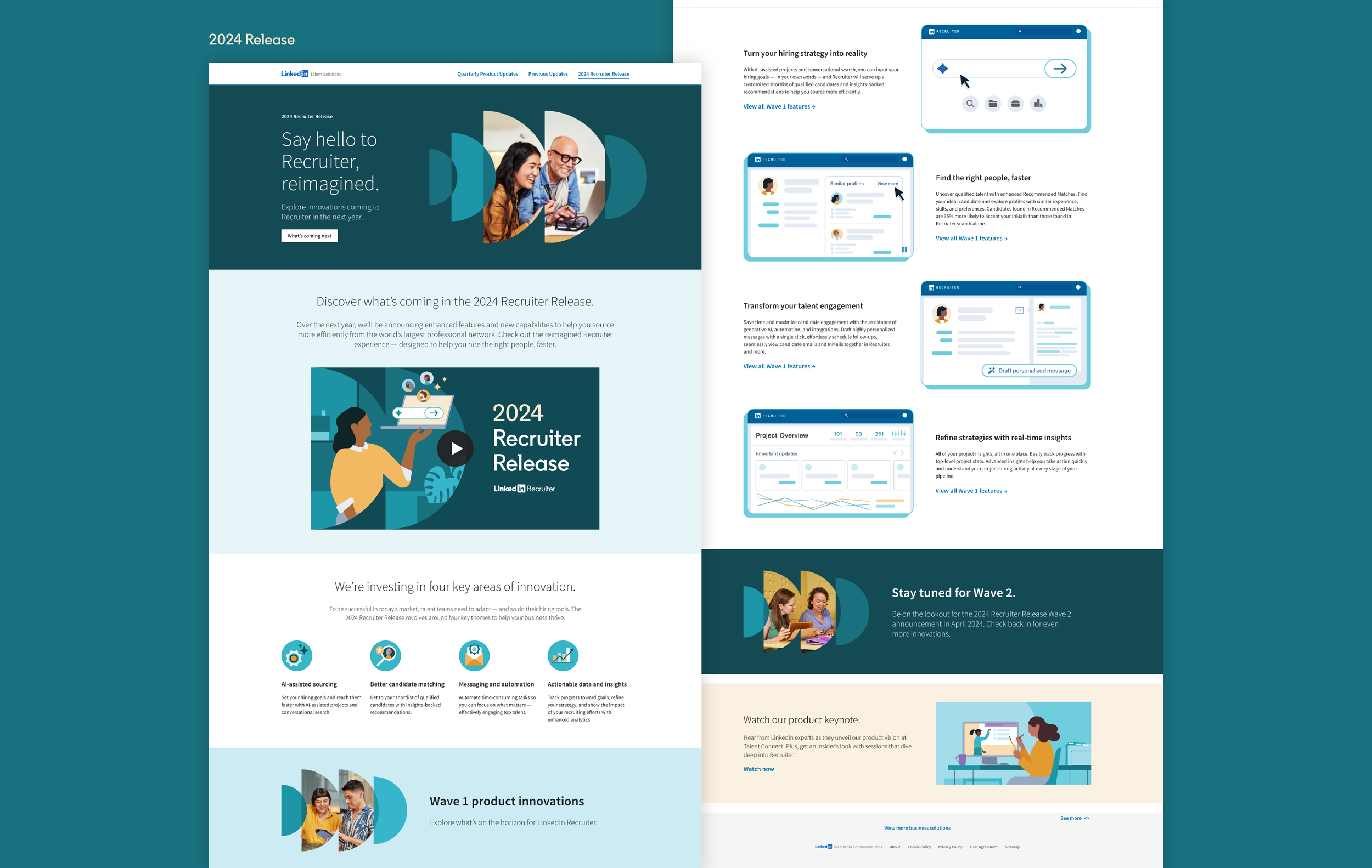
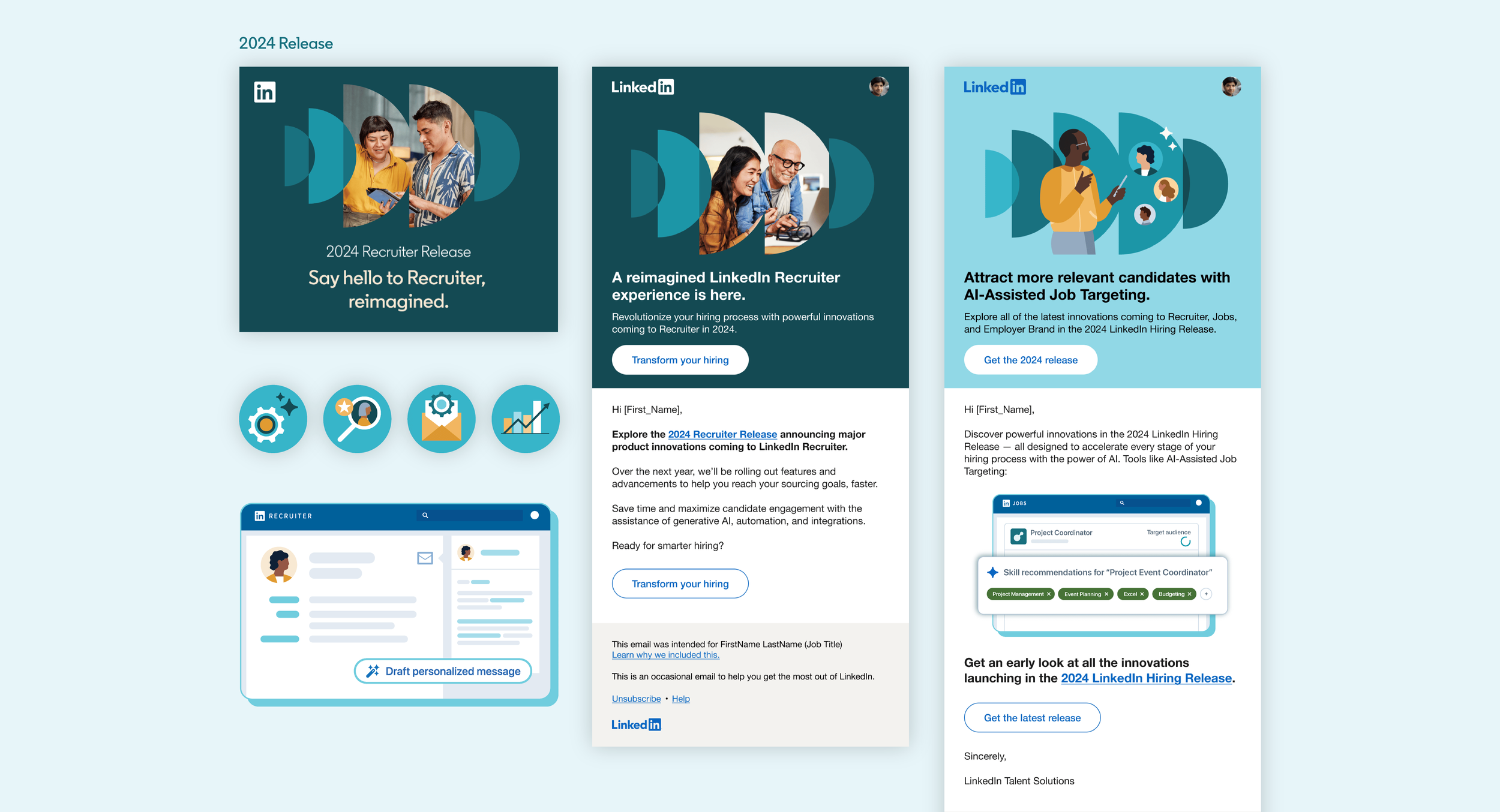
In 2024, our concept was inspired by the constant energy and innovation as LinkedIn develops new features to meet their customers’ hiring needs. We created a toolkit of assets using overlapping semicircles to create a sense of forward movement—within the fairly limited LinkedIn brand system, this became a unique and ownable new look for that year’s Release.
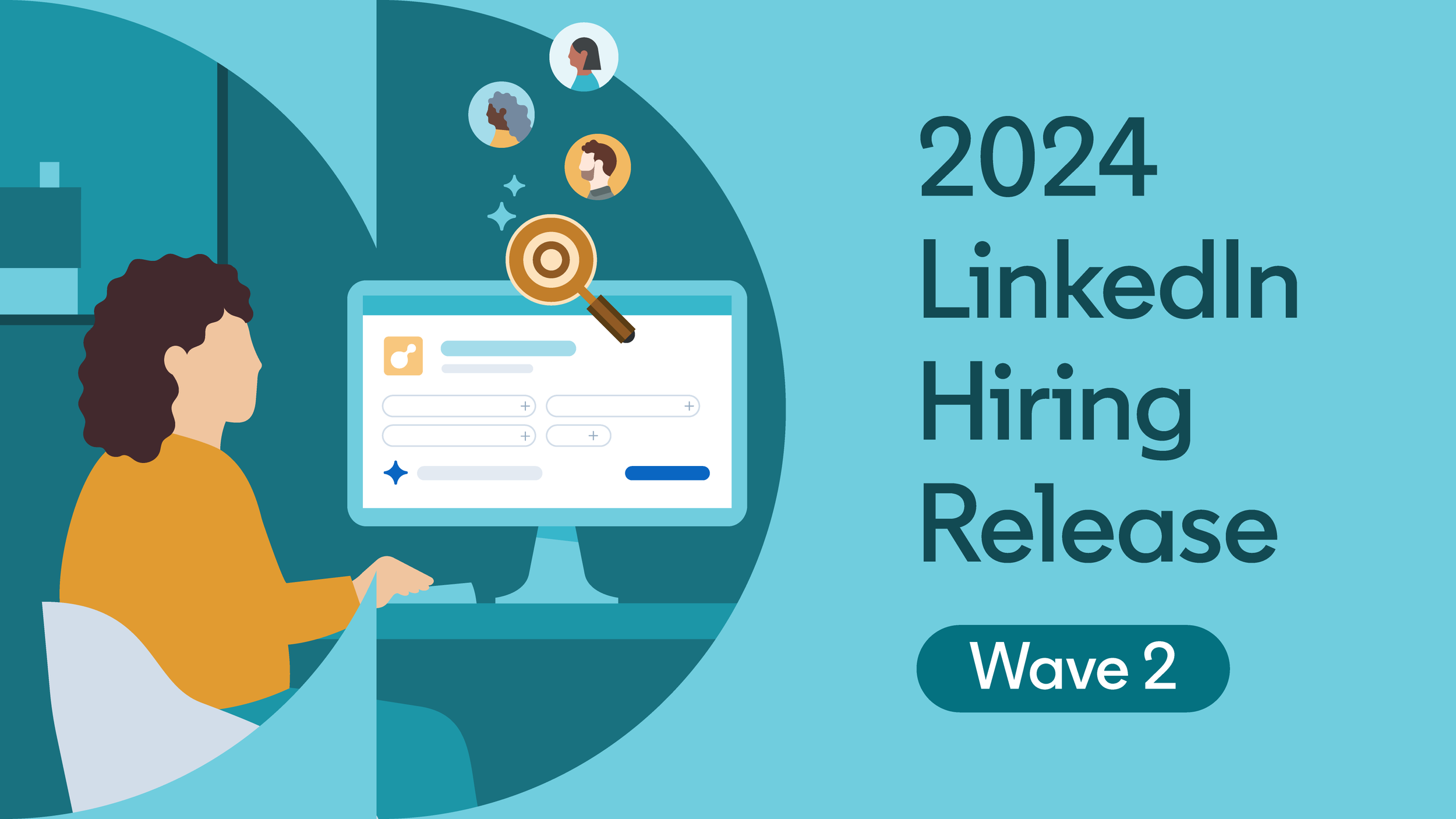
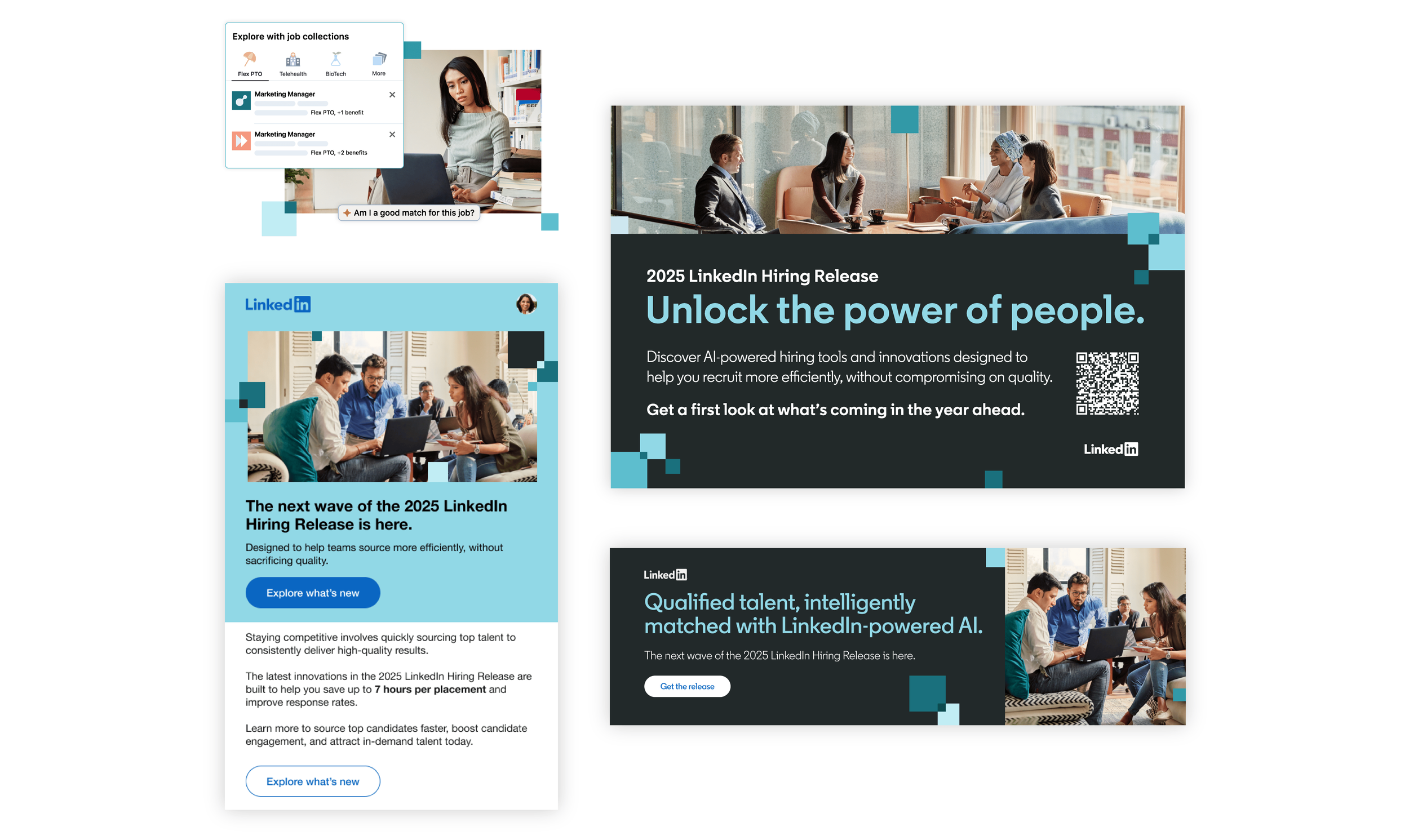
Assets included a microsite, emails, social banners, quarterly product hype videos, and UI animations. And because this campaign highlighted features that were still in active development, we leveraged a very simplified future-state UI to convey functionality to customers and get them excited about the possibilities.
Based on metrics for digital engagement, press coverage, and positive rep conversations, the 2024 Release was a record-setting campaign for LinkedIn, which exceeded their initial engagement targets twice over. Our work became the new gold standard for the Hire marketing team, and other product teams pushed for similar revamps.
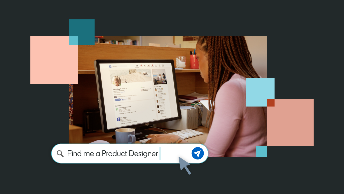
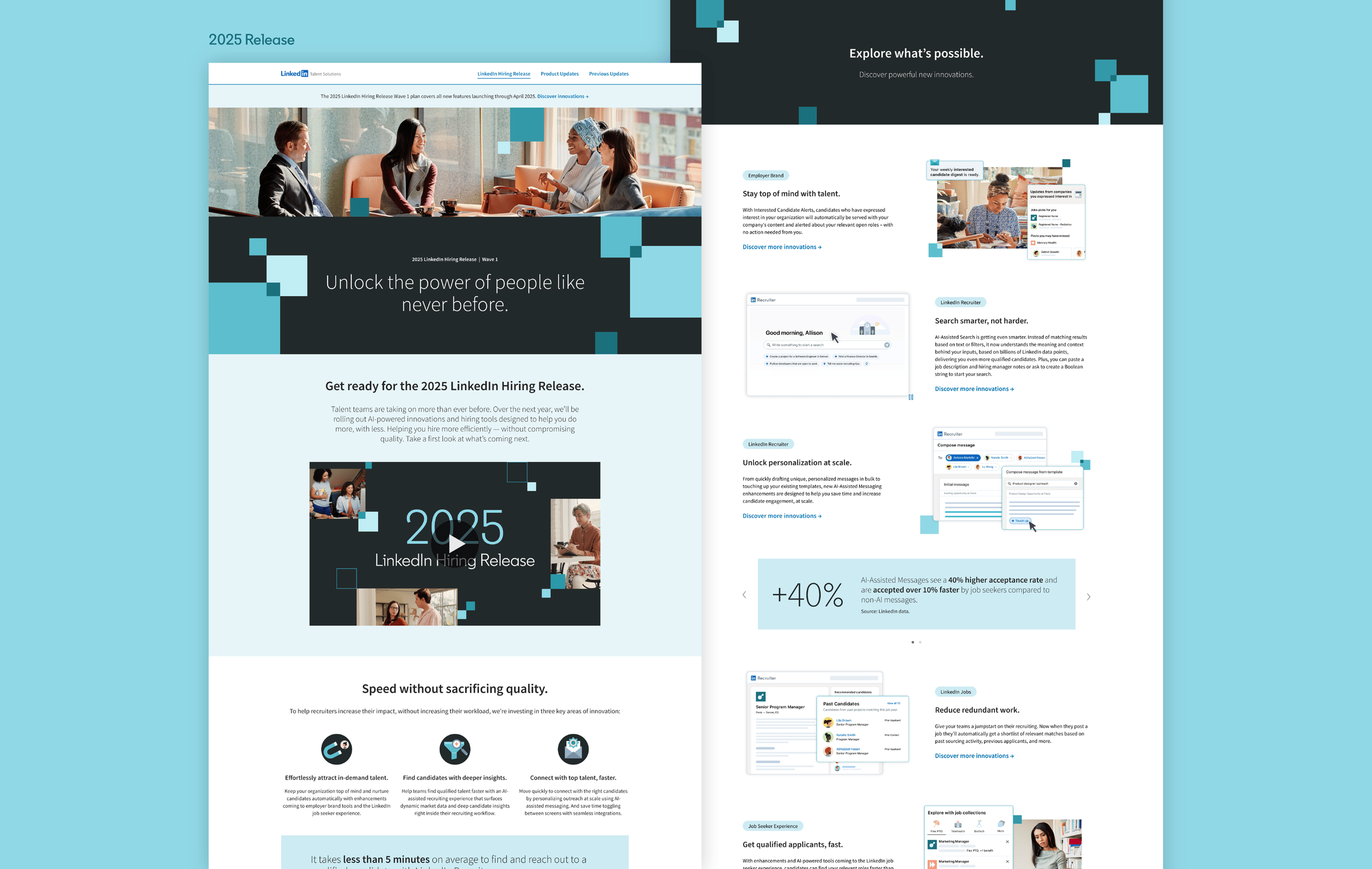
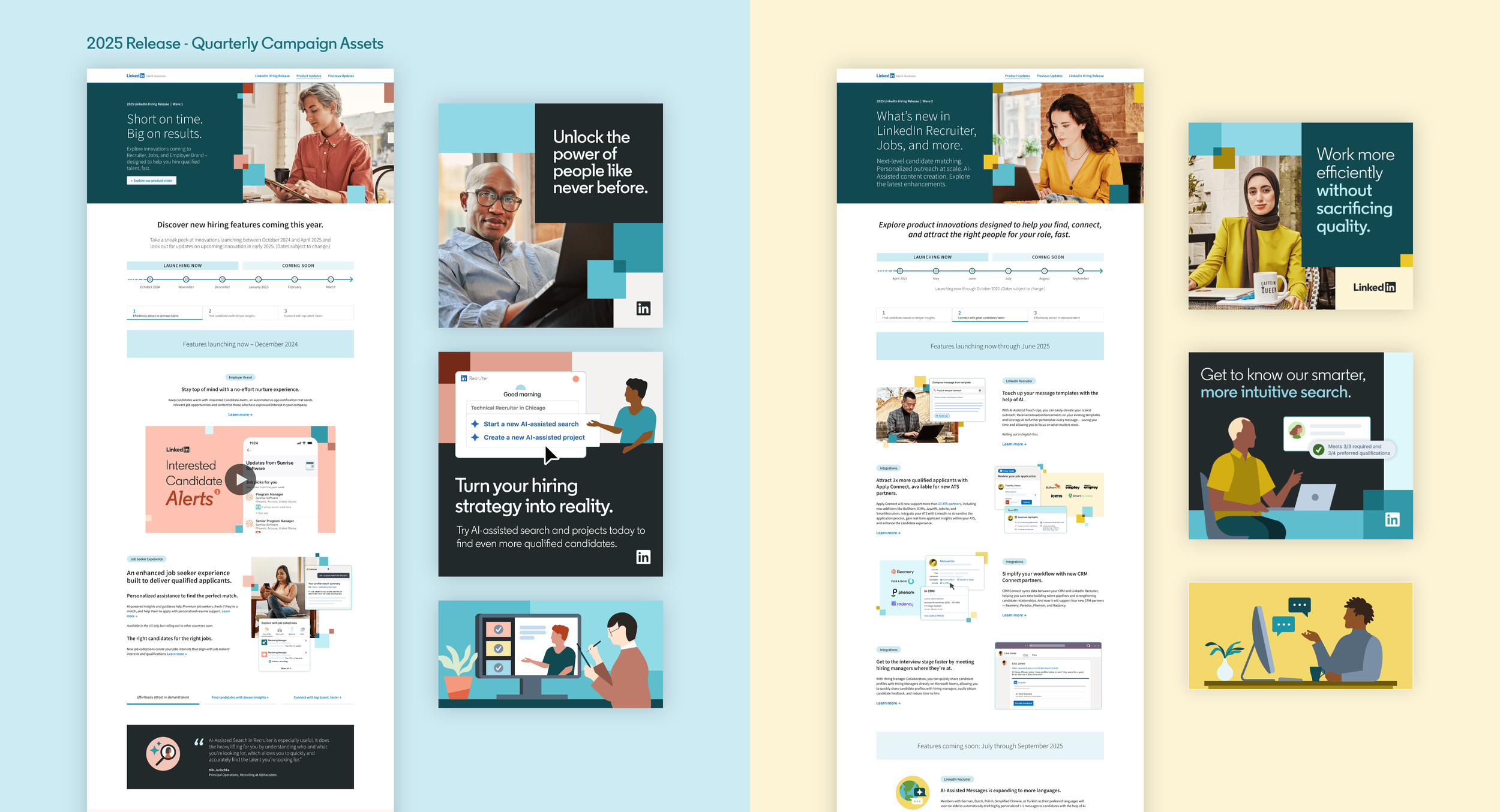
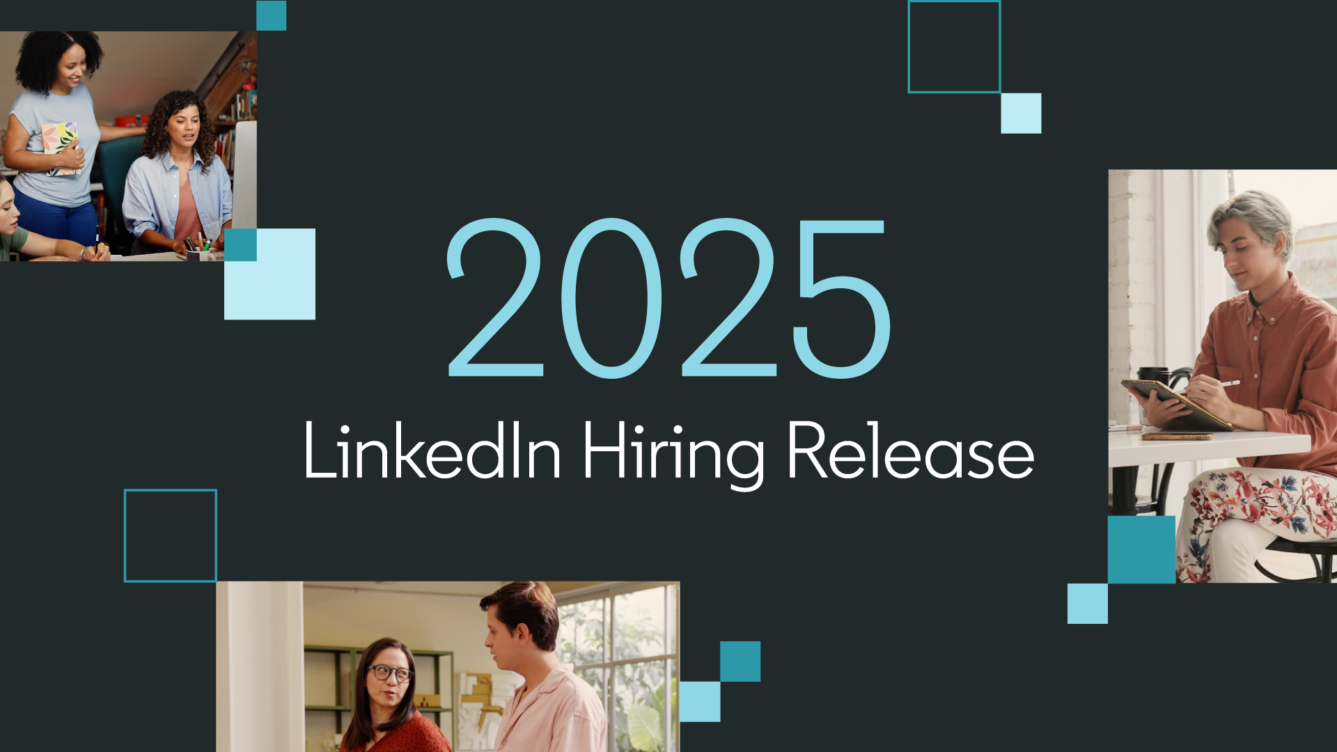
Based on the success of the 2024 campaign, the team asked us to create a new look for 2025 that would keep the successful components of the previous launch while continuing to elevate the customer experience. The focus continued to be highlighting the cutting-edge innovations that unlocked time savings and better results for customers.
We created an evolved design language with dark gray accents, a focus on brand photography, and a flexible patchwork of overlapping squares that would allow us to build dynamic new compositions with each quarterly update. We also revisited the UI illustration style, staying simplified but with more polish and depth, including a treatment that layered it with photos.
I built the design system with flexibility in mind, so quarterly revamps could leverage a cohesive system but still feel distinct. Each quarter has a new accent color and featured updates, brought to life within a versatile web design that optimized the process and development time each quarter.
Hiring Release continues to be a yearly priority for LinkedIn and I hope this work becomes the basis for more innovation in years to come.
Copywriting by Wendy Fink, Mandy Haga, Robin Singer, Tom Buchanan. Creative direction by Jeff Deamer. Animation by the team at Monks.