


With over $1.5 billion in assets, SFF is one of the nation’s largest community foundations, working together with community leaders, nonprofits, and donors to advance racial and economic equity.
I had the incredible opportunity (and challenge) to overhaul the San Francisco Foundation’s visual identity as soon as I came on board in-house, with a focus on centering community and reflecting SFF’s vibrancy and power as an organization.
In the foundation’s 70+ year history, they’d seen several logos come and go, and agendas also changed along the way. The organization made a dramatic shift in 2016 to establish equity as its north star—and the very corporate red box needed to catch up to this message. Rebranding was a natural opportunity to build on the legacy while strengthening outreach in the community and bringing in new audiences.
We internally evaluated our existing identity system, getting input from staff and trustees, who also shared outsiders’ impressions.
The design exploration phase resulted in nine distinct identity concepts ranging from a slight evolution of the red box to total departures with no box in sight. Aside from staff and trustees, we reached out to grantees, professional advisors, donors, and other partners for feedback and refinements before selecting the final concept, a significant departure from the previous logo.
The winning concept uses a dynamic, interconnected patchwork contained inside SFF. With many pieces coming together as one whole, it embraces the interconnectedness at the heart of the community foundation—a thought leader, convener, and partner to nonprofits, donors, and community leaders, who together help make an impact on the issues they care about most. It also reflects their focus on honoring and uplifting diverse voices, all of which are essential to building a strong and vibrant Bay Area.
The identity system includes a toolkit of supporting elements and style cues that define the new look of communications, including a vibrant & expressive color palette, bold typography, dynamic angled layouts, and an exuberant accent pattern.
I created robust brand guidelines detailing all aspects of logo usage + elements in the visual identity system and conducted all-staff trainings on the rollout. The process was complete within a year, with all branded materials and items updated to reflect the new look.
As part of the launch, I wrote two blog posts about the new identity, one for the public announcement and one with a more detailed look at the process and system.
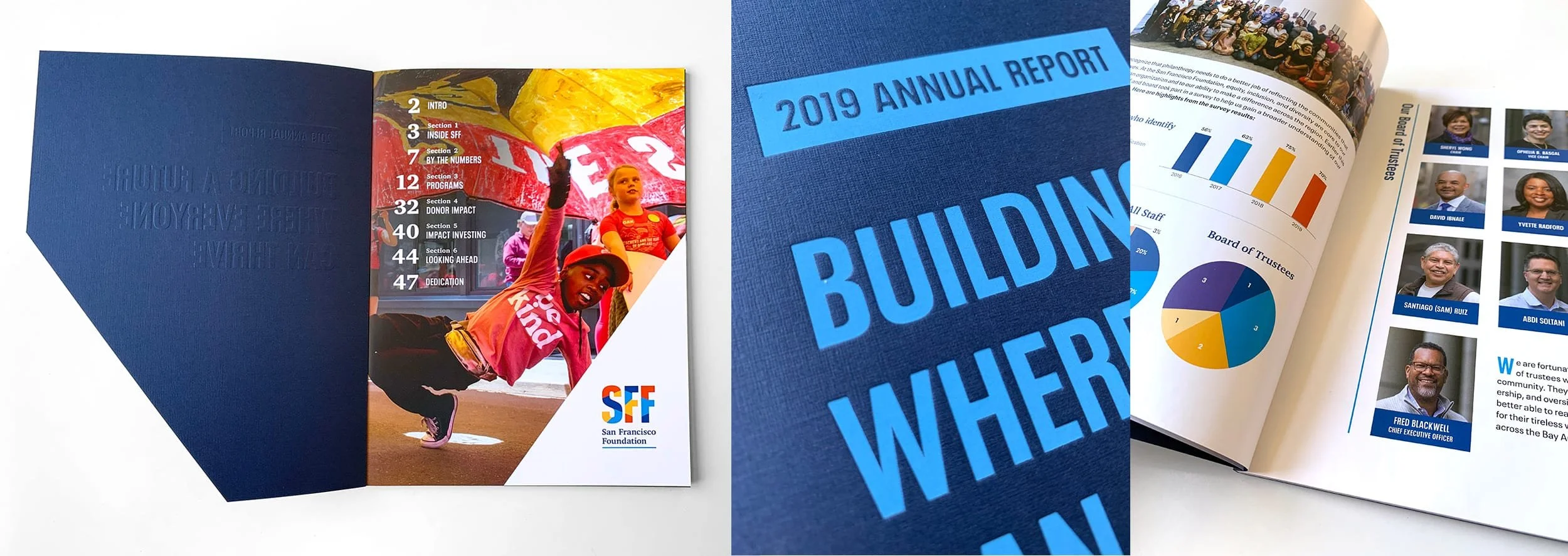
In close partnership with other members of the Marketing & Communications team, I also designed an annual report that took both digital and print forms. With a combination of data and storytelling, this piece serves as a summary and celebration of the foundation’s work, a reinforcement of impact for donors, and a vital fundraising tool.
All work designed in full by me as the San Francisco Foundation’s in-house designer.