

Sprout is a digital content platform that empowers growers—whether beginners, hobbyists, or experts—to deepen their plant knowledge and build meaningful connections with nature & with each other.
I partnered closely with the co-founders to create a brand that reflected their vision of a captivating and welcoming movement that fosters curiosity and gets people excited about plants.
As a fresh start-up, all that existed before we began was a temporary “proof of concept” logo created by the founders to represent their idea. Our goal was to elevate the identity beyond the expected and create something that better reflected the spirit and mission of Sprout.
To lay a solid foundation for future materials that can grow as Sprout does, I worked with them to distill their vision into a clear and meaningful brand strategy that informed the unique, vibrant visual identity.
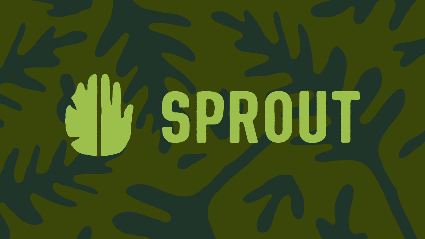
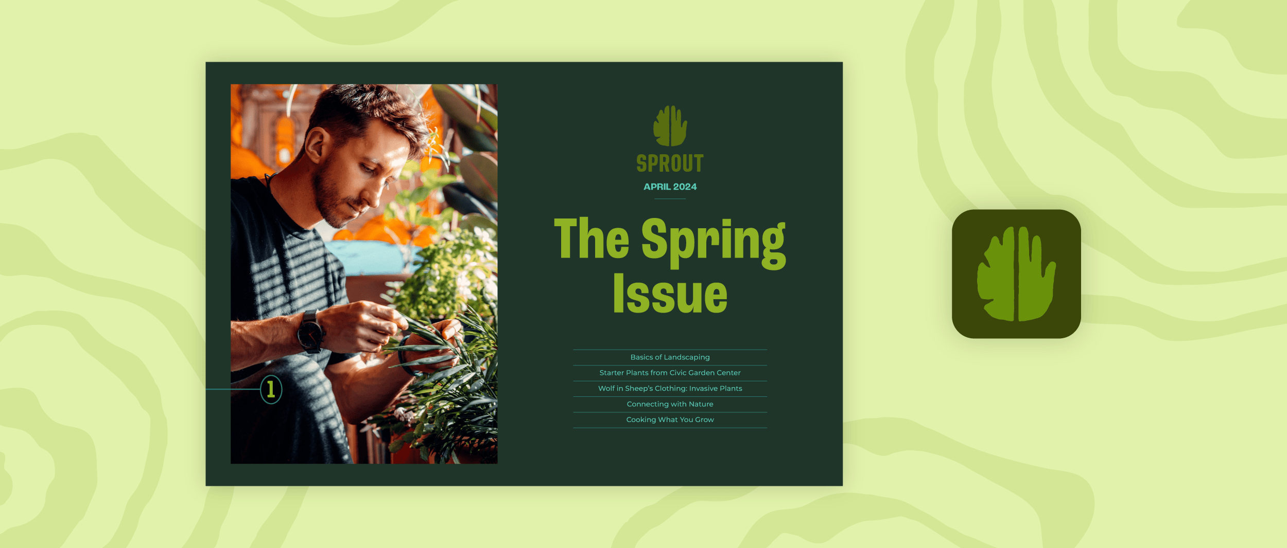
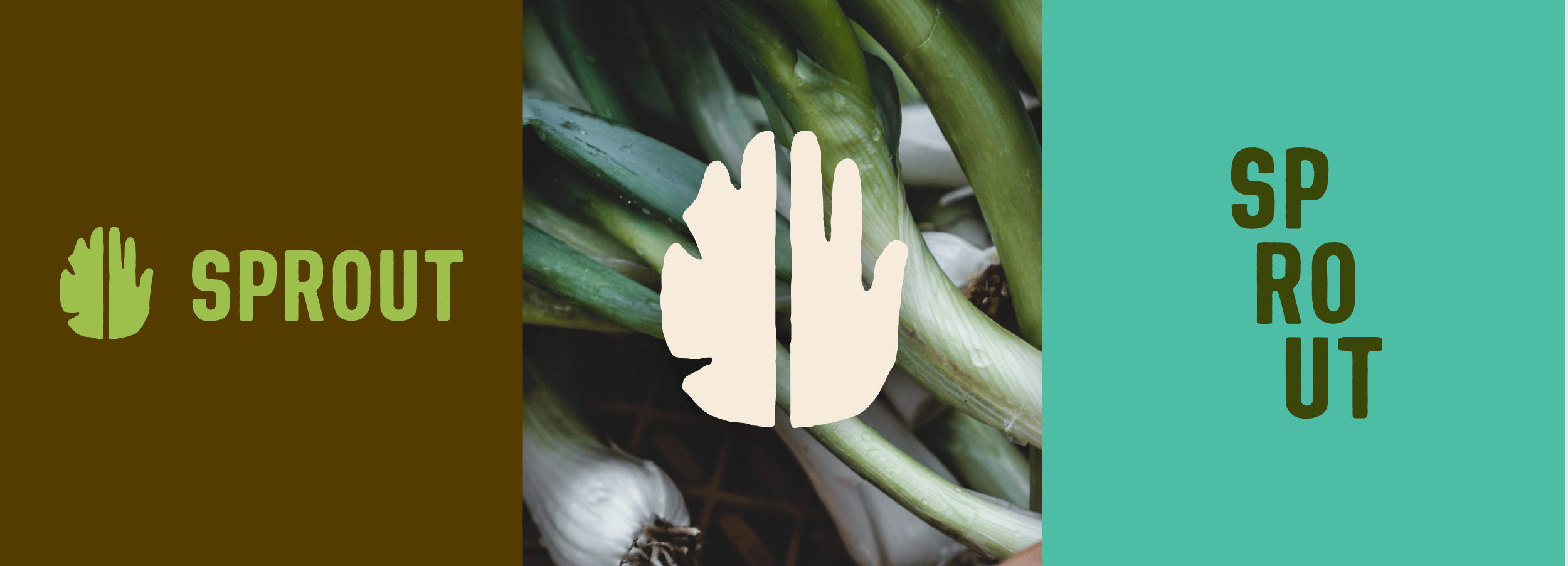
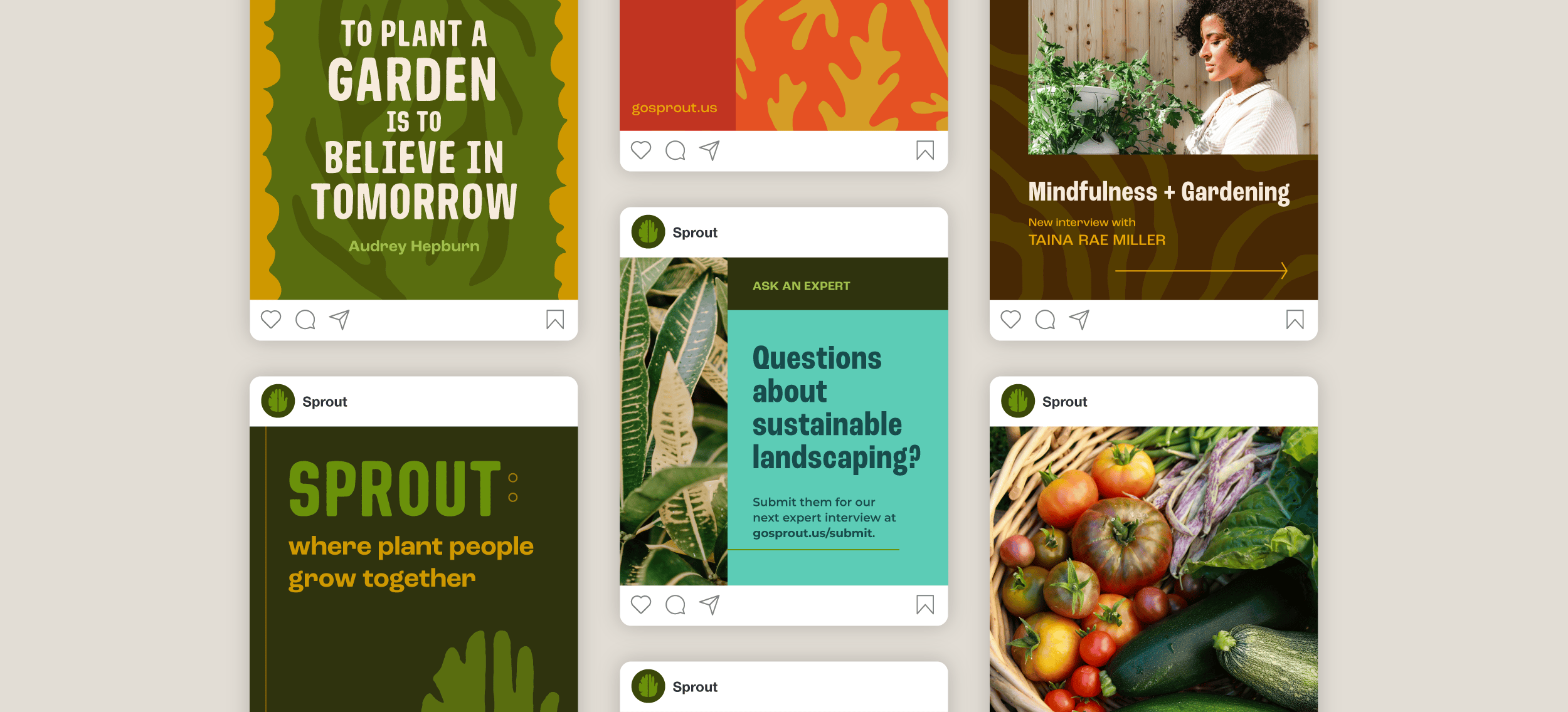
The new logo system centers on a hand-drawn leaf & hand symbol that represents the connection Sprout fosters between people and plants—and how both can thrive in balanced collaboration with each other. The bold type has both power and approachability, with a slight texture for an organic touch.
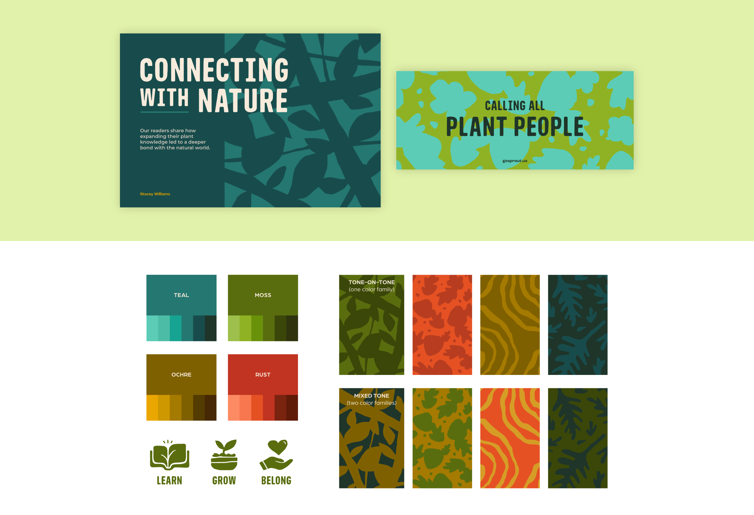
The color palette is made up of rich, saturated tones, paired together in eye-catching and sometimes unexpected ways. I created illustrated background textures of plant-inspired motifs drawn in a rough, cut paper style to add depth and personality to layouts. This is a starting place for the brand toolkit, with the idea that the texture library could continue to grow with the brand.
The flexibility of layering color, quality photography, illustrated textures, and bold typography creates the potential for dynamic layouts that still speak with a cohesive brand voice that sets Sprout apart.